


Visualisation idea: Animated population movements
Posted by Alex on 6 Jan, 2016 in Data & Visualisations, Ideas & Innovation | 0 comments
[This is “Idea dump” post #1]
One area where I’ve had a few ideas, is thinking about how useful animated maps can be for understanding change of populations, empires or societies over a period of time. Here is just one of the many examples of YouTube videos and interactive visualisations online that do this:
The specific idea that occurred to me today, was that this technique could be applied to visualise the movement of people between towns and cities within a country, for example within the UK.
One way I could see this working would be that, based on compiling per-town annual population statistics into a large database, you could then render a dot or circle for each town with a size proportional to its population, forming a single map for each year (which would stay on screen for a few seconds). You would then compare each town’s population to the stat for that town in the previous year and identify whether it was a gain or a loss. Of course, you would need a geolocated lat/long coordinate for each town to serve as the centre of the dot.
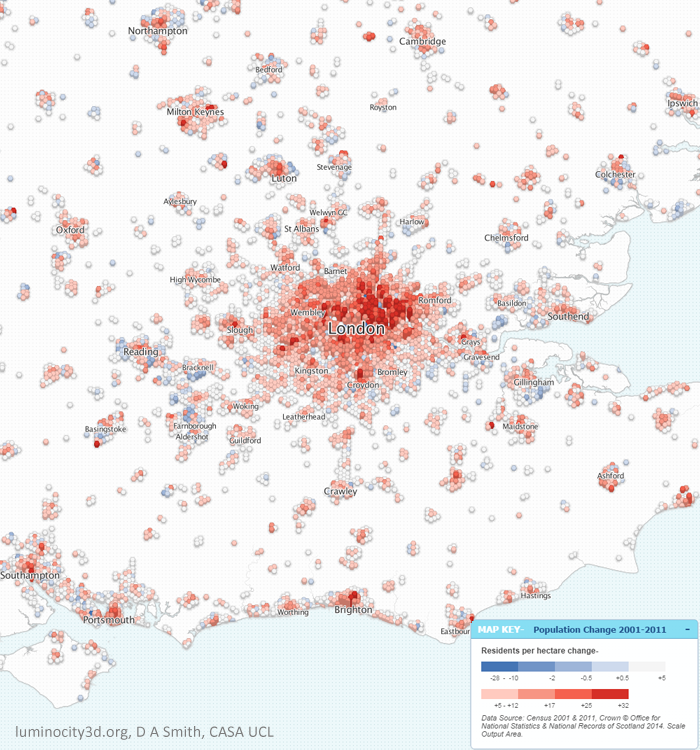
I think a colour scale for each town’s dot something like this would be useful: dark red -> red -> grey -> green -> bright green. Grey would indicate “no change”, dark red would be “major loss of population since last year” and bright green would be “major gain of population since last year”.
You could then stitch these frames together into an animation to give a really clear visualisation as to how a country’s population is moving. Is there predominantly a move into cities, or to the country? Are influxes of population matched by losses elsewhere? (A more advanced version of this visualisation would distinguish between population growth due to immigration and internal population movements).
In terms of how it would look, I imagine a single frame might look a little like the header image of this post, which is featured in a different visualisation here (though in my visualisation there would be more green and less red).
Google Earth does allow timeline-based maps which change over time – perhaps the result could be created as a layer for Google Earth. Tools like this may help. Some related data for the UK can be found here. A similar project was carried out for US cities, though this focusses more on the geographic spread of the cities, whereas the idea I present is about population.