


Posts Tagged "user-centricity"
A much more usable way of visualizing product reviews
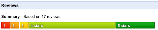
I was just using Google Product Search and noticed they have this rather ingenious way of visualizing the totality of all the reviews that have been submitted. Instead of averaging everyone’s scores together, a bar graph shows how many people gave each ranking of 1,2,3,4 or 5, with each person’s vote counting for the same “length” of the overall bar. The ratings are colour-coded so you can see at a glance what the general consensus is.
An example of how the Internet is shifting the balance of power in society
This video has just “gone viral” on Twitter and elsewhere. Everyone is forwarding the link around.
All you need to do these days in tell your story, and if it’s sticky enough, the world will spread it, far more effectively than any company’s PR department can.
As social networks online grow, consumer power grows. Companies that treat their customers badly need to wake up and listen, or this will happen to them too.
You can read the full story at Dave Carroll‘s site. Whatever he lost in the value of that guitar, he will soon gain back in getting his music to new audiences.
Oh, and the best bit? There’s another two songs still to come…!
An example of good user-centric design
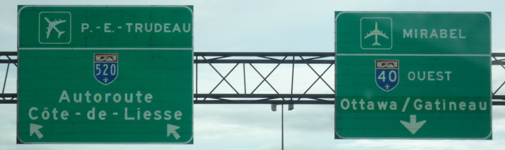
When were on the way to pick up our friend from Montréal airport on Sunday, we noticed a subtle but very useful design feature on the overhead signs. There are two different airports in the vicinity, and a number of different lane changes are required. Typically when you see signs to an airport (certainly this is true around Heathrow or Gatwick in the UK), it’s always the same icon of an aircraft.
What they have done here is angle the aircraft differently on each sign, according to whether you need to stay in the same lane, need to move left or need to move right. In doing so it serves as a subtle direction arrow. And when I think about it, I can remember at least one occasion being caught out by aircraft signs in the UK where the plane pointed in the opposite direction to that in which I needed to go. The authority that put up these signs has apparently done some research with drivers into how they actually understand the signs, and have discovered that because the shape of a plane is similar to an arrow, people subconsciously read it as such, so have chosen to make sure the aircraft signs are giving clear signals under both interpretations (as an arrow as well as an aircraft). This is a great example of how you can improve your product by doing additional research into how it actually gets used in the field. Read MoreAn example of bad usability

When I was in Las Vegas recently, staying in the Luxor, I experienced one of the worst designed pieces of technology that I've seen in a long time. Every day when I returned to the hotel, I had to get the lift back to my floor.
Each of the lifts had the same restriction in effect – you need to insert your room card, and wait for it to register (which sometimes doesn't work first time). Once it has been accepted, a green light will illuminate (if not, you get a red light or yellow light.) I have no idea why there are 3 possible states! Then you have about 4 seconds to press your floor button. If you press it in time, the floor button illuminates and locks in. If you miss your window (or someone else presses an illegal button) then you have to start the whole thing again.
OK, well it's a bit of a faff, but what's the big deal, you may ask. Well it's true that if you are riding the elevator on your own, it's awkward but doable – but as soon as you have more than a couple of people in the room the whole system resorts to chaos. Let's imagine there are 3 people, wanting to go to floors 3, 7 and 11. (It gets even more crazy when the lift has 6 or 7 people and not everyone can reach the buttons!). Anyway, in this example, Mr. 7 happens to be first, puts his card in, and presses the button. The lift starts moving towards floor 7. So now we have a lift that's in motion, but most of the people in the car haven't put their floor in yet. Mr. 3 puts his card in, and after a couple of tries gets it to accept. But we've already passed floor 3. So the button push is rejected. He has to wait until the lift is descending. Which means it's Mr 11's turn. He puts his card in just as we're arriving at floor 7. But before he can push the button, the lift (which now thinks its free) gets summoned to the ground floor. 3 and 11 are now right back to square one, on the ground floor. And so it goes on! It can take several minutes and unnecessary journeys to actually reach your floor, not to mention all sorts of unfamiliar social situations for which there is no established lift etiquette!
This is a great example of how designers can easily fail to consider their users when adding new features. The reading of the room card was clearly added for security – but they completely failed to consider the dynamics of how it would work in practice in a crowded lift.
Read MoreMalcolm Gladwell on spaghetti sauce
Just came across this talk by Malcolm Gladwell telling a story of how the food industry learned about the need to identify different types of tastes rather than looking for the “most popular”. This ties in neatly with some of the ideas I have blogged about before about the need for anyone developing a product or service to find out your user personas and decide which ones to target, rather than taking a one-size-fits-all approach.