
building the future, one idea at a time...


An example of good user-centric design
Posted by Alex on 5 Jun, 2009 in Articles | 0 comments
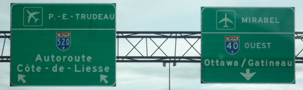
When were on the way to pick up our friend from Montréal airport on Sunday, we noticed a subtle but very useful design feature on the overhead signs. There are two different airports in the vicinity, and a number of different lane changes are required. Typically when you see signs to an airport (certainly this is true around Heathrow or Gatwick in the UK), it’s always the same icon of an aircraft.
What they have done here is angle the aircraft differently on each sign, according to whether you need to stay in the same lane, need to move left or need to move right. In doing so it serves as a subtle direction arrow. And when I think about it, I can remember at least one occasion being caught out by aircraft signs in the UK where the plane pointed in the opposite direction to that in which I needed to go. The authority that put up these signs has apparently done some research with drivers into how they actually understand the signs, and have discovered that because the shape of a plane is similar to an arrow, people subconsciously read it as such, so have chosen to make sure the aircraft signs are giving clear signals under both interpretations (as an arrow as well as an aircraft). This is a great example of how you can improve your product by doing additional research into how it actually gets used in the field.