Posts Tagged "visualization"
Visualization of 4,000 years of democracy in 90 seconds
Nice animation showing how different ideas of governance spread around the world. Slightly oversimplistic in parts, and lacking some details, but still, a nice way to represent it.
Here’s the history of religion too:
And the history of the Middle East:
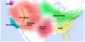
How to split up the USA using Facebook data
This is really interesting… Someone has analysed Facebook data to discover which parts of the USA are most connected to each other. Based on what little I know of the USA, these clusters do seem to represent the different cultural divides within the country. It’s amazing what you can find from social network data.
Make sure you check out the application too, which lets you see which countries are most connected, what their favourite celebrities/topics are, and their most common names.
Update: This article on ReadWriteWeb is well worth a read too, and explores the subject in more depth.
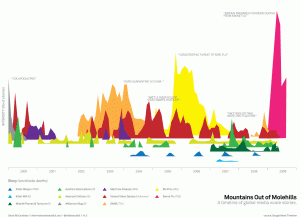
A great visualization of media hype
A great visualization of global media scare stories over time – Swine Flu is measurably bigger than previous hyped stories.
80s T-Shirt with a twist
Listen along and you will understand this shirt. Rather clever IMHO
Read More


